What style of furniture should you choose? How can you make the most out of your display area without weighing it down? Are you looking to both save space and open it up? Even liven it up a little? Enhance it, or otherwise give it that personal touch?
These 14 tips are a sure and easy way to transform your little spot into a goldmine of opportunity.
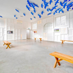
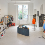
- Stick with white furniture
When your pop-up store comes with white walls, one simple solution is to match them with all-white furniture for storage and display. It’s the perfect way to break the space up and add variety. What’s more, white furniture will blend into the walls, becoming less conspicuous. They will disappear while offering you a real capacity for storage. And last but not least, white will reflect the light in your store!
- Or try transparency
The transparency of glass or plexiglass shelves, tables, chairs and desks make them seem almost invisible. This technique will visually lighten up your shop, small as it is, and let your products take center stage.
- Expand your space with a mirror
It’s an essential feature of any store where customers might want to try before they buy, but a mirror also tricks the eye in terms of space. Because of its reflective qualities, a mirror can “break down” any blank wall, pushing the boundaries, so to speak. And when choosing a size of mirror, bigger is often better.
- Light it up
The many roles that light can play in store design is frequently overlooked: colors, textures, shapes, but also space. For the latter, remember that a well-lit store with no trace of shadows may appear larger than one that is larger in surface area but insufficiently lit. The idea is to multiply the lighting (suspended, spotlights, floor lamps, string lights) instead of using a single powerful light source that will blind customers.
- Color the floor
Perhaps you weren’t aware, but adding a monochromatic floor to a room with white walls makes it seem more spacious. You can also play with the lines created by linoleum or carpet, as lines elongate the space visually. Finally, tiles placed at an oblique angle will do this better than parallel tiles set perpendicular to the walls.
- Optimize every nook and cranny
In this Amsterdam pop-up store, a railing becomes a shelf for displaying handbags and a flight of stairs is the perfect place to showcase a few pairs of shoes!
- Aim high
This technique is especially true if your store is blessed with a high ceiling – make up for lack of floor surface by optimizing the walls!
For example, this LA clothing boutique has made use of frontal display with hangers to add a dozen extra clothes.
Arranging furniture and clothes racks high up in a store, in different configurations, can often even out the volume of a narrow space. This Milanese store uses the technique, juxtaposing two wooden racks on tapered legs with metal racks and putting a shelf that plays with asymmetry in the middle of the room.
- Set up a central island
When designing the layout for a retail space, most of us begin by placing shelving and furniture on the walls. But don’t overlook the potential of a central island: while offering an additional display area, it facilitates the movement of customers through your space. From a stylish designer table to a long and narrow carpenter’s workbench or even a display cabinet – there’s no shortage of choice.
- Dare to be original
Your pop-up store may not be huge, but it can accommodate even your wildest dreams! Personalize the space, brighten it up, innovate and create your own unique displays and shelves. Take the lead from this pop-up store in the Marias district of Paris, which is an open invitation to come inside and explore!
- Bring your display to life
Once again, the element of surprise goes a long way. Display your clothes or decorative throws in a variety of configurations: laterally on racks, frontally on suspended loops and flat on a central table. The gaze of curious customers will be drawn around the store, traveling a distance far greater than seems possible, covering the entire space.
- Color code it
The store above, on Saint-Germain in Paris, has another idea well worth mentioning: arranging the display of its collection by color. Visually, this creates a sense of perspective and organizes the space. It’s just like at home, for example, where arranging books according to size and color always seems to lighten up the bookshelf and declutter the room.
Even more precise: you can organize your display according to color and by matching items or prints according to their pattern!
- Extra-large height
We often mistakenly believe that decorating a small space means filling it with small pieces of furniture, sometimes in excess. On the contrary, these elements frequently end up seeming invasive and bulky. Better to choose a large and eye-catching storage area that will add a new dimension to your space. Especially when super-sized width and height is used, such furniture will conceal the narrow passage in front of it.
- Curves and a pair of colors
Did you know? Two-tone paint makes a space feel twice as large when the colors are juxtaposed next to each other. Also, when circles and curves are used in a small square or rectangular room, they transform the volumes: angles are softened, and all sense of measurement escapes us at that moment. Opt for large round mirrors, round mandala-like rugs and round tables of different heights.
- Decorate the walls
Instead of breaking the bank in an attempt to visually enlarge your store, you can also set it up as a little nook, very cozy and inviting. Pre-pasted trompe l’oeil wallpapers, which you apply with moisture and take down the same way when you leave, will allow you to create an atmosphere that is unique, colorful, artistic and chic. Your walls will disappear, leaving an escapist haven in their wake.
Looking to generate some buzz with a pop-up store? Find your dream venue from among + 10 000 references available on our Platform!
- 14 Ways to Maximize a Small Space - September 18, 2018
- 14 Cost-Effective Ways to Decorate Your Pop-Up Store - September 12, 2018
- 16 Smart Ideas for the Center of Your Pop-Up Store - August 21, 2018

