From pop-up galleries, to boutiques and event spaces, New York City is full of short-term space ideas and brands who love the concept of ‘popping up’. E-tailers and brands are not afraid to experiment with pop-up spaces in New York to impress their customers and get extra creative.
Storefront has helped brands all over the world rent their perfect short-term space and transform it into a memorable concept. From FILA to e-commerce brand Grammar, below are 3 brands that have completely transformed these Storefront spaces into the pop-up store of their dreams!
1. Grammar
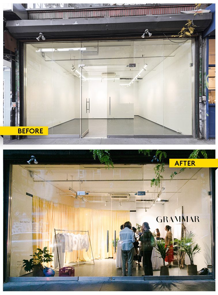
Selling ‘perfect white shirts’ Grammar kept to its minimal aesthetic while popping up in New York’s Lower East Side this past month. Althea Simmons, the brand’s creator, intentionally wanted to create a space where her customers could come in and meet her, and feel taken care of.
- The challenge: to create something that visually and emotionally conveys the values of the brand.
- Decoration tip: mix in some customized pieces so the store has its own personalized touch!
- The ‘wow’ effect: the store’s huge windows stood out on Rivington street where customers could peek in and see the beautiful, crisp shirts on display.
- What we love: Althea Simmons, the creator, paid such attention to detail from the logo on the window display to the big yellow curtain that lined the back wall
2. Princeton
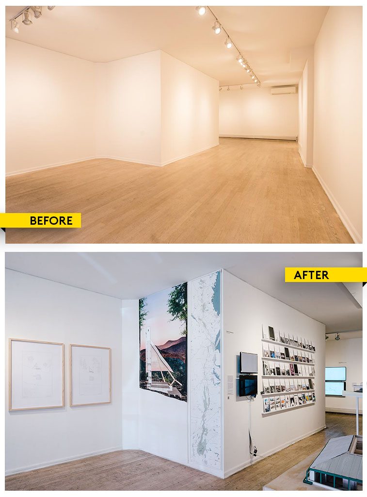
Students from the Princeton School of Architecture showcased their post-graduate thesis with this pop-up gallery in LES. In selecting a high-traffic storefront, their work and gallery was able to stand out and attract crowds.
- The challenge: to create an inspiring pop-up gallery on a limited budget
- Decoration tip: Use the walls of the room to inspire where you put and display your artwork or designs. For these architecture students, utilizing as much of the space as possible was key to showcasing the different elements of their work.
- The ‘Wow’ effect: The students created a gallery that was dynamic from every corner of the space.
- What we love: The students were able to create a gorgeous space on a budget, including versatile elements that helped their projects stand out and take advantage of the space’s interior.
3. FILA
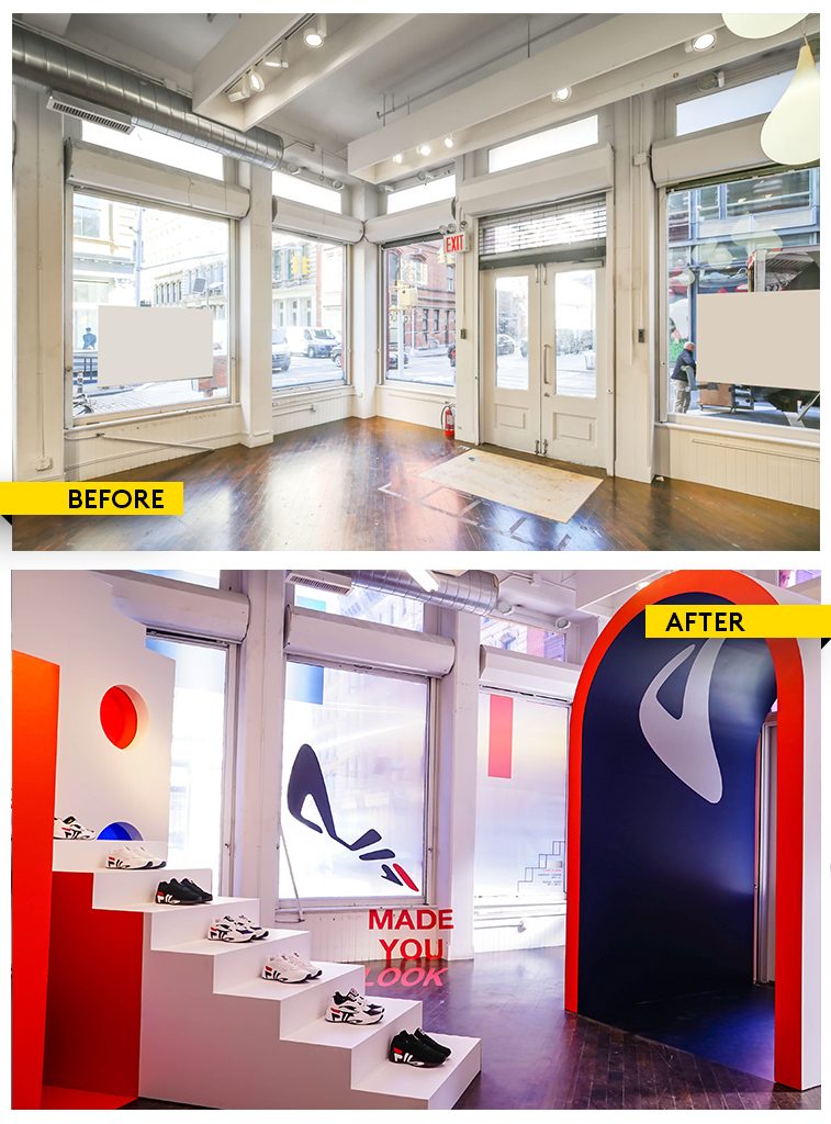
FILA launched its pop-up store in SoHo last month to honor its heritage and create a visually memorable space for its customers to walk in and try on their newest collection.
- The challenge: The brand needed to create a contained and immersive experience, so the space had to be large enough to capture the many visual and design elements.
- Decoration tip: Know the kind of feeling you want to create. For FILA, the brand wanted a warped reality kind of feeling so decorated with optical illusions in mind.
- The ‘Wow’ effect: An immersive in-store experience from the entrance, to the windows, to the entire interiors, all decked out with heavy FILA branding and colores
- What we love: A brand that has a strong space concept and can creatively execute from every detail
Find the perfect space for your pop-up project in NY >>
- London-Based Lifestyle Brand Mantidy Launches Pop Up in Marylebone - November 13, 2019
- Fashion Retailer SHEIN Opens Dallas Pop-Up Shop With Storefront - November 11, 2019
- Howard Johnson popped-up with a candy-themed store in NYC to support brand refresh - September 13, 2019

