As the most “basic” color out there, white is a kind of magic wand for many professional painters, following the famous adage “white goes with everything!” Yet it’s worth asking if white really does go with everything, especially as far as retail spaces are concerned.
The effect white has on walls is closely linked to the ambient light of a space, not just in terms of daylight, but also with the artificial light of evening. Since the quality of white depends on light, even the brightest white fades to gray when underlit. It’s also important to remember that there are hundreds of different whites, with varying degrees of radiance, and hot or cold tones: from a genuine “snow” white to the trendy, almost beige “linen” white…all proof that this color is anything but “basic”!

Advantages
- As white is pure light, it brightens up the darkest rooms. What shade of white you choose should depend on light quality: a somewhat cold, north-facing room works best with warm tones and pink or apricot hues, giving it added warmth.
- Due to the “light” effect that opens up a space with white walls, rooms appear larger than they really are. But white is not the only color with this property: every pastel color can produce the same effect. There are times when a light pink or very light blue on a wall works better than pure white, because it brightens the space up without making it feel empty.
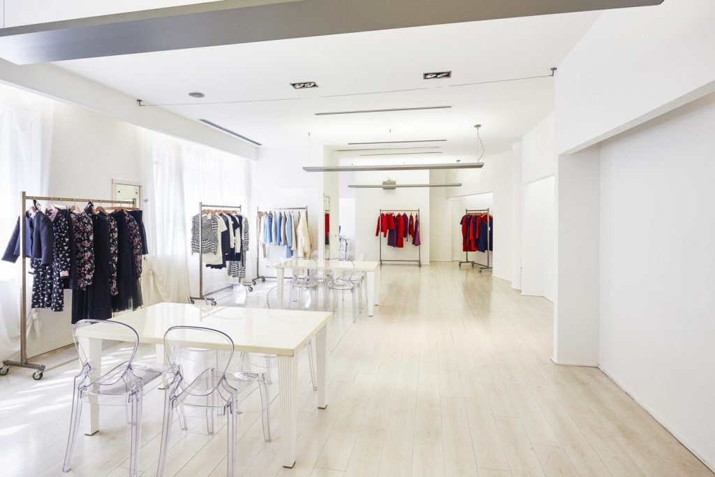
- White is perfect for a contemporary look. Pure white is the color of choice when designing an ultra-modern space dedicated to light and purity. It’s common knowledge that any furniture must also have the same effect: sleek lines, chrome-plated metal, lacquered surfaces (white), a few touches of bright colors or even black, because the white-black duo is a powerful graphic symbol.
Disadvantages
- Is white too empty? White also symbolizes the void, or non-existence. For example, French has many common expressions about the color white: “avoir un blanc” or “draw a blank,” “l’angoisse de la page blanche” or “writer’s block,” etc. Although decorating magazines have long extolled its therapeutic powers, in fact “empty” is not for everyone and can evoke stress in some people. Scientifically speaking, white is considered a stimulant due to its strong luminance. It is therefore not suitable for spaces that are intended to be intimate and welcoming.
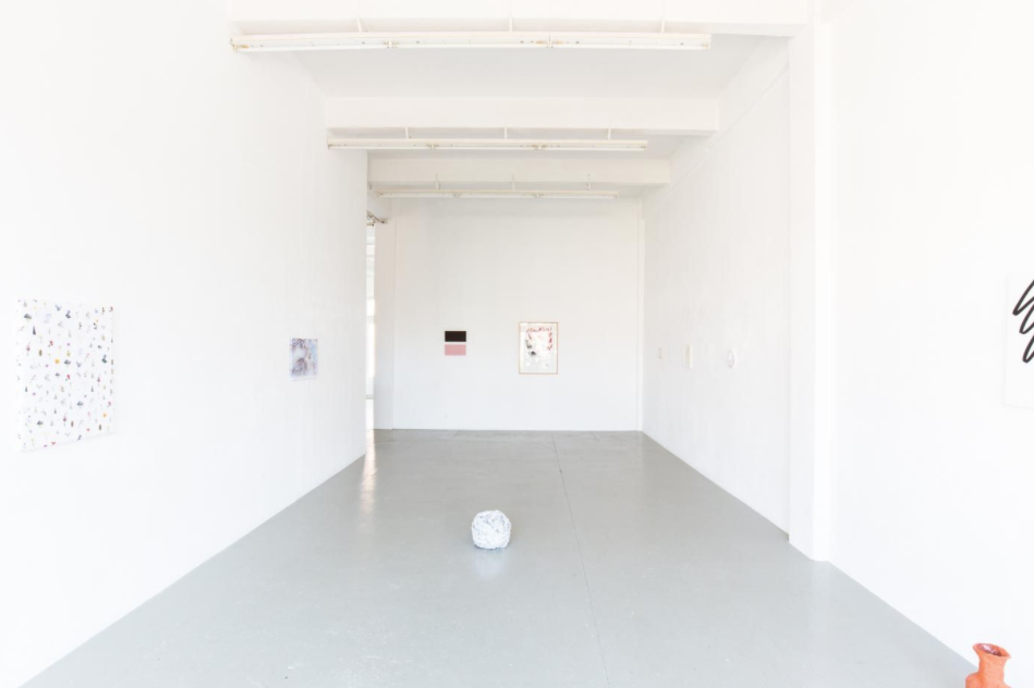
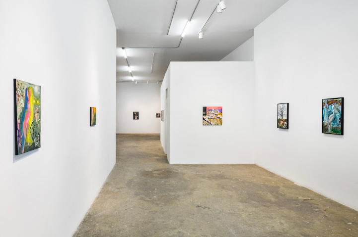
- White is brutally honest. It important to understand that white tends to reveal every color in a space! White walls, for example, will not necessarily be kind to what lies inside them: paintings, pictures, mirrors or prints will all appear dull and seem to “float” in empty space. The reason is simple: the brightness of white is so strong that it absorbs all other colors. That’s why I would suggest using strong, vibrant hues to give any decoration on the wall prominence.
- White could be accused of being anonymous and bland, especially if it is used incorrectly, which is to say chosen by default. The palette of available colors is so rich that, more often than not, your time is better spent studying the space and what is happening there before choosing the right color, instead of relying on basic white which is equivalent to choosing… transparent! Each color gives your space an energy and particular meaning, connected to the over-arching message: in a space that makes sense, the act of buying also makes sense…
Solutions
- White tones transform pure white. There are a variety of whites with subtle tinges of blue, pink, orange, and other colors combined. It is essential that you consider the light in the room before choosing your shade of white. Make sure to ask the right questions: does your space get a lot of light or is it limited by a weak and gray light?
Tip: warm the cold light of north-facing rooms with an apricot- or pink-tinged white and bring more light to well lit rooms with bluish white, which will add the same “white effect” to your walls as whiteners used in laundry liquids (blue particles)!
- To give a space character, combine white with bright colors, such as yellow or turquoise (mentioned above) to brighten it up.
Tip: Do not use more than two other colors, whether for another wall or for furniture. More than three colors will saturate the eye…
- Balance white with black: this duo is perfect for creating a solid starting point and is suitable for all spaces. One proposal that works really well combines white walls and black architectural details (moldings, baseboards, columns, and even pipes and ventilation ducts…). With this elegant and timeless combination, the small defects that white brings out will disappear, and you will even be able to add another color as a complement!
For more inspiration on how to design your retail space
Find the perfect space for your pop-up project


