Logo designers use colors to communicate one or more messages about a brand. They are directly related to the specific values of a brand, such as power, reliability, security, or even kindness and respect for the environment…
Since consistency is a key part of effective marketing, it is important to establish the link between a brand’s logo, which signifies its identity, and the colors used for the façade and interior of its point of sale. This visual connection acts as an extension of the brand’s verbal communications, carrying its own unique values inside the store. Here is a demonstration of how a few success stories made color work for them.
- Red: Strength and Intensity
Red is highly recommended for evoking the values of strength and power, because its presence and warmth recall the pure energy often associated with passion and movement.
Note:
- Reds are always eye-catching: even in small doses, reds are sure to communicate a strong presence.
- Brownish or bluish reds, such as burgundy and certain “wine” reds, evoke a sense of land and tradition: the artisanal gesture, the quality of independently grown products, the authenticity of building a human relationship through personalized service.
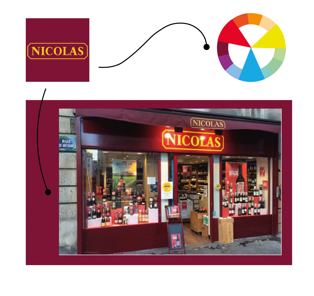
Example: Nicolas, French wine retailer
Dark red is essential for Nicolas, a major French wine retailer, because perhaps more than any other color it reminds us of wine! At the same time, the Nicolas logo is accented by a touch of very bright yellow, thus adding a contemporary feel to the brand’s traditional image as an established wine store. Yellow may also be there as a reminder of moderation, important for maintaining the festive and fun side of wine drinking.
- Blue: A Color You Can Trust!
A cool and “stable” color, blue embodies tranquility, security, trustworthiness or even languor. The safe values it communicates are sure to inspire trust.
Note:
- The lighter and airier a shade of blue becomes, the more we associate it with the mind or spirit. A pale blue can be used to evoke values of creativity or rebirth.
- Intense or dark blues tend to be more physical and may even elicit a sense of security.
- Turquoise is a color that deserves special mention, because it invites people to open up and communicate!
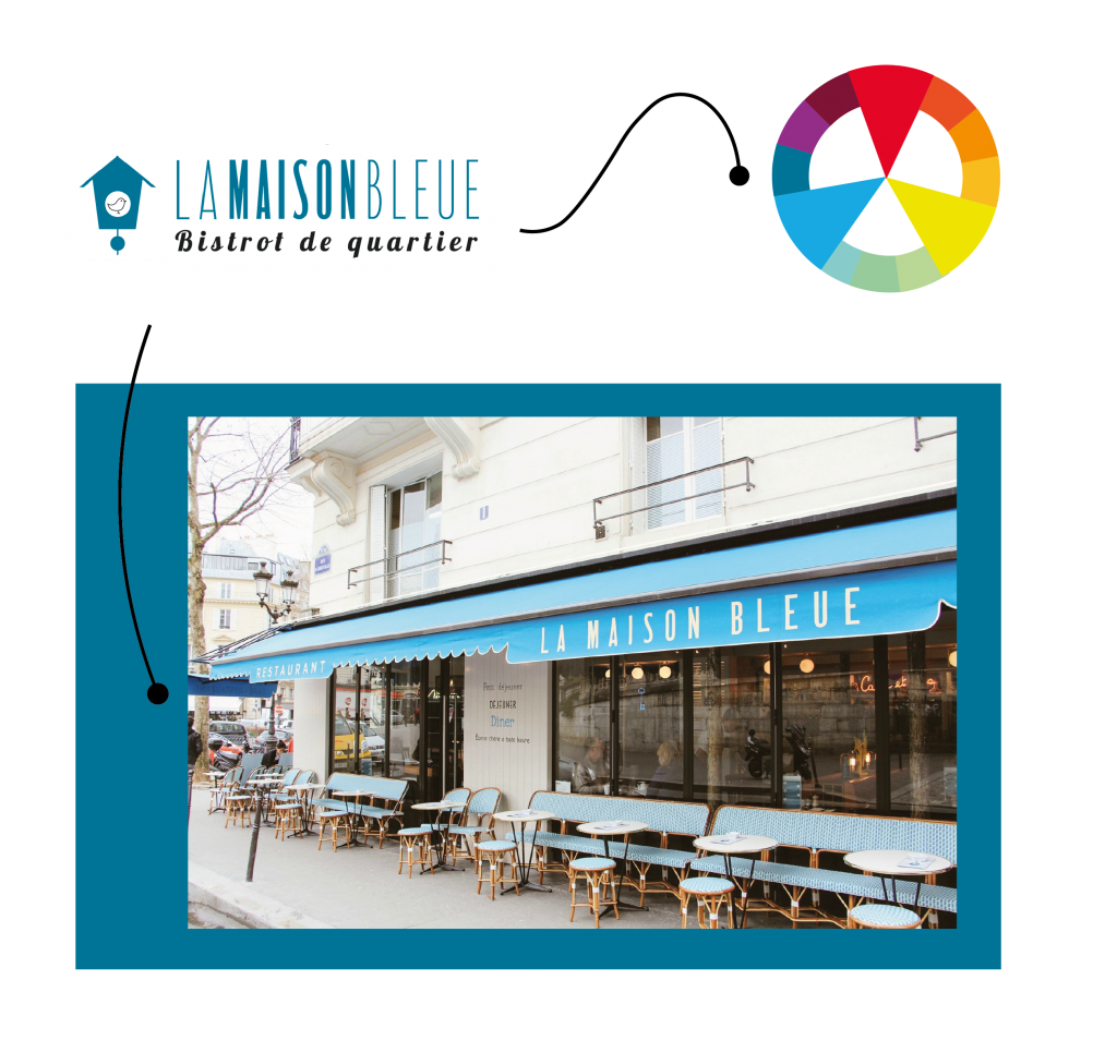
Example: La Maison Bleue, a Parisian neo-bistro
Leaving tradition behind but remaining firmly within it at the same time: this is the challenge of this restaurant sign, which evokes a friendly and lively ambiance where diners can enjoy traditional bistro fare. Their choice of turquoise, a very singular color that combines the strength and security of blue with the sparkling spirit of yellow tones, allows such a challenge to be met with success. The “good old days” is here given a fresh new look, all the while retaining a sense of the familiar.
- Yellow as a Reassuring Sign
As a symbol of light, it is logical that yellow is used to create the identity of brands who want to communicate one of the qualities we associate with light: speed, clarity (often linked to the spirit or mind), and also originality.
- The most active bright yellow, in small doses, remains very visible and will be especially effective when used next to a dark color, such as navy blue or, of course, black.
- Energy, speed, vivacity: yellow is the color that stands out the best at a distance, literally piercing through any dark areas.
- In fact, yellow can mean clarity and peace of mind: it’s the solution to all your problems!
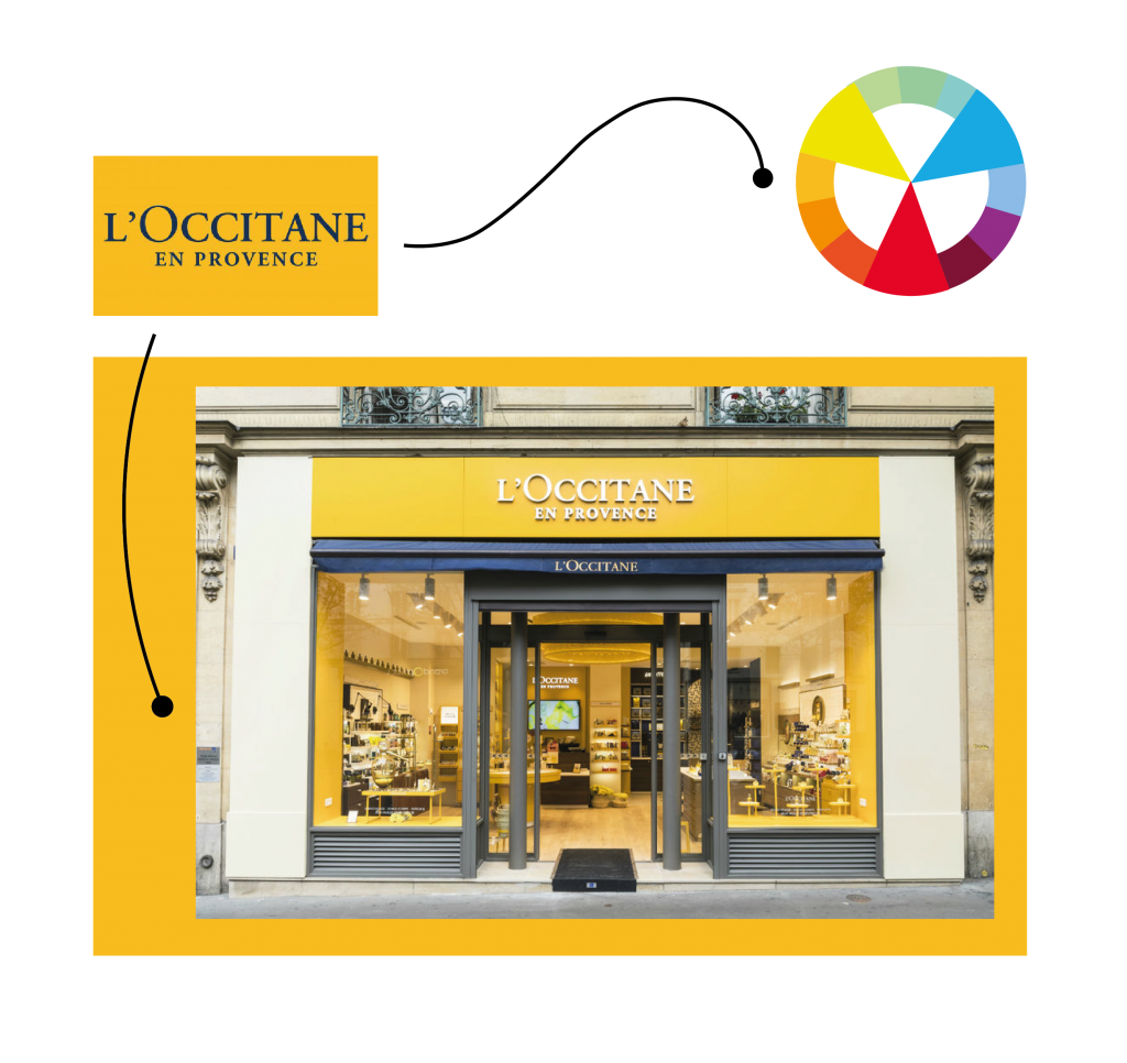
Example: L’Occitane, natural cosmetics
Provence is the source of inspiration for the natural products of L’Occitane. Sun-kissed soil and ingredients that are the source of vitality: what could possibly be better than sunflower yellow to symbolize this brand!
4. Black: Luxury’s Favorite Color
In graphic design, black is often used in reference to the world of luxury. Elegance and complete exclusivity remain, in our collective unconscious, closely related to this color, which is devoid of all excess.
Note:
- Rarity and high standards are often evoked by black, but it also conveys individuality and marginality. If the brand can match such values, daring to use black on a storefront will immediately set you apart as something “different.”
- Black has the incredible ability to enhance all other colors: next to black, colors seem more vivid. The choice of accent color can also change the message and soften the strong presence of black.
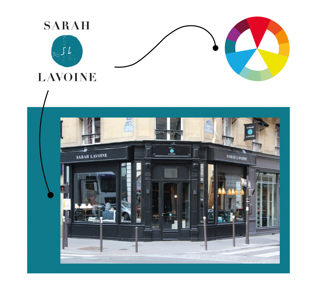
Example: Maison Sarah Lavoine
The combination of “black and turquoise” used by decorator Sarah Lavoine makes black a timeless and luxurious contrast, while introducing vibrant new shades into an otherwise very neutral bourgeois universe. Black is a true basic!
MISTAKES TO AVOID
- Diluting the “corporate” message by multiplying unnecessary information with an influx of colors that do not match the brand’s graphic communication.
- Contradicting the “corporate” message with totally opposite colors, or colors very far removed from the originals. For example: a red logo and a green interior! If a person entering the shop does not understand what is happening, or worse, has the impression that they’ve entered the wrong universe, the sale will be seriously compromised!
My tip: In order to recognize opposite colors quickly and efficiently, look at a color wheel, where you will see them directly facing each other!

