In the world of retail space design, white remains the color of choice for most walls. And yet this “basic” color has more than just merits and may actually be perceived as cold. Are you renting a white space for a few days, weeks or months? Customize that white box and use it to project your brand DNA! Here are a few tips on how to effectively replace white in a store without losing the beautiful luminosity and feeling of open space that it provides.

1. Use So-Called “Neutral” Tones
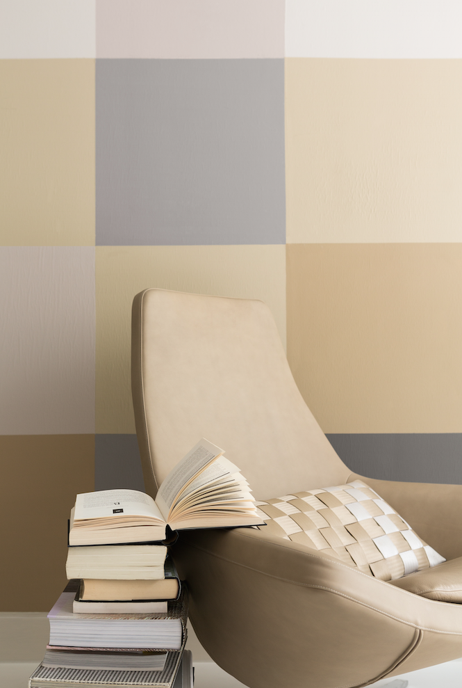
These are shades such as gray or beige, considered discrete and versatile. They are called “neutral” because unlike other colors, they give off almost no radiation at all, neither warm nor cool. (e.g.: Neutral range, Dulux-Valentine)
Here are their properties and benefits:
- The lighter the shade chosen, the more luminous it will be, thus creating an effect similar to white.
- These tones are pleasing to the eye and have the enormous advantage of going with all other shades.
- “Neutrals” bring softness to a room, enveloping its walls in a velvety veil of color that is both unobtrusive and quite elegant.
- Similar to white, these very light tones have the added benefit of visually enlarging any space. A very pale gray or soothing beige will always be more enjoyable than pure white, giving customers the feeling of walking into a kind of “cocoon” as soon as they enter the store!

2. Try Pale Pink or Rose Quartz
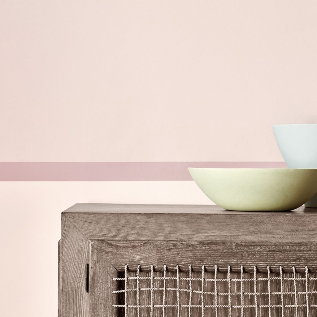
Contrary to popular belief, very pale pinks are not perceived as exclusively feminine. In fact, the brand Little Greene has color charts composed entirely of pink shades, some of which are almost “nude,” a natural skin tone that is very interesting for interior design due to its “sophisticated natural” effect.
Among these, I would choose the Dorchester Pink series, three shades of nude pink ranging from the palest to the deepest, one or more of which can be adapted to meet the requirements of your space – or even used in combination.
Rose Quartz, on the other hand, is ideal for anyone wanting a cooler, more mineral and thus “masculine” shade.
Still not convinced? Here are 3 solid reasons for choosing one of these pinks:
- A very pale pink adds light and softness to walls, which makes the room appear bigger, even in the most confined spaces. (e.g.: Little Greene Dorchester Pink – Mid)
- A “warm” pale pink will warm up a cold room: as the light in north-facing rooms is often a little bluish and will distort the color your products, pink walls counteract the distortion by reflecting a warm glow into the space… (e.g.: Little Greene Confetti)
- On the contrary, rose quartz, a shade of pink inspired by the semi-precious stone, is cooler and can be used to help refresh or soften the walls in south-facing rooms. (e.g.: Rose Quartz Tollens by Pantone. For purchase at Castorama)
Find the perfect space for your project from more than 10 000 references around the world


