Achieving the perfect design layout for your Storefront is a great first step, but even better is attracting passersby to want to step through your door! What’s the secret behind a successful storefront? Color is key to set yours apart from the crowd, make it visible from near and far, and ensure your signage communicates your brand message in a way that is clear and perfectly aligned with your business. Here’s how.
- Get their Attention with Contrast
Some color contrasts immediately attract our attention, even at a distance, because our eyes cannot resist being drawn to them.
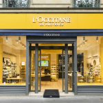
- The most powerful contrast out there is the combination of yellow and black. It makes an even greater impact than the classic black/white duo, which due to the “invisibility” of white, is only moderately effective.
- Of particular interest is the contrast that results from complementary colors: orange and blue, purple and yellow, red and green. When used together, their intensity is heightened, because they make each other more vibrant. For example, next to a certain blue, an orange hue will beam brighter, even in small doses.
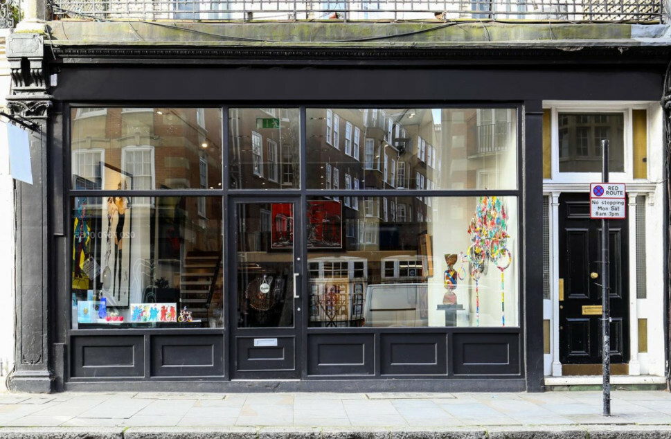
- Remember that all colors get a boost next to black (or dark gray), so you can combine a black storefront with bright or light color accents to stunning effect.
2. Steal the Show in Your Neighborhood
Of course, if your storefront is yellow and your neighbors are competing to have the brightest colors, you will actually be less visible than a predominantly gray color scheme. That’s why you should check out the storefronts on your street before choosing your brand color.
- Draw on the power of contrasting colors explained above to make your shop more appealing to the senses. Your neighbor’s storefront is blue? Use orange to your advantage, because even in small doses, it will stand out more than any other color.
- Take the plunge with bold or surprising colors that possess great powers of attraction: whether it be peacock blue, sun yellow, powder pink or mint green… be unique! That said, the color you choose should always be in line with the message you want to communicate: sweet with a powder pink so pretty you could eat it, originality with a dazzlingly minty green, or the cozy power of peacock blue, a deep color that has recently made its mark in retail design!
3. Use Eye-Catching Color
Some colors have an almost cosmic ability to attract. This is certainly the case with yellow, red, orange and turquoise. Just look at how some wild animals use these colors to their advantage!
- Yellow is the most visible color, even at a distance, provided you choose a warm and brilliant tone such as sunflower yellow. Its conveys a supremely positive message, like a light at the end of a dark tunnel.
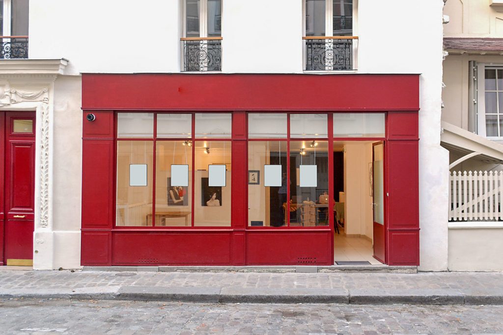
- Red is the second most powerful color. It is also highly visible at a distance, but the message it carries is altogether different: heat and strength, but in high doses, power or even danger! It depends upon the hue of red you choose, with some being more advisable than others. Two of my personal favorites are the lively but soft coral red and wine red with its deep, authentic strength.
- Orange, in its warmest tones, is a cheerful color with a welcoming message. But be careful, because of its connection to 80s Pop Art, it is part of a color group that, like green, sparks an immediately negative response in some people.
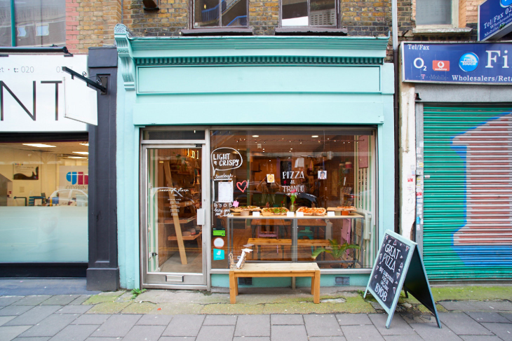
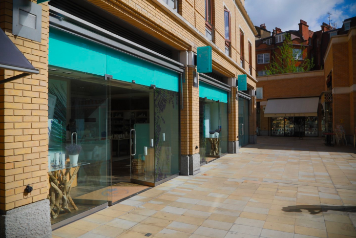
- Long absent from professional color palettes, turquoise and the family of “peacock” or “petrol” blues are now everywhere on the retail scene. These colors have been making a comeback since 2015, following the influence of “vintage” design trends. Their success is warranted, because these warm blue shades have everything going for them: they are reassuring and arouse feelings of trust. And in contrast to some cold blues, they carry an innate sense of wellbeing. That’s why turquoise is widely considered the best color for creating a welcoming space where people want to spend their time!
For more inspiration on how to design your retail space

