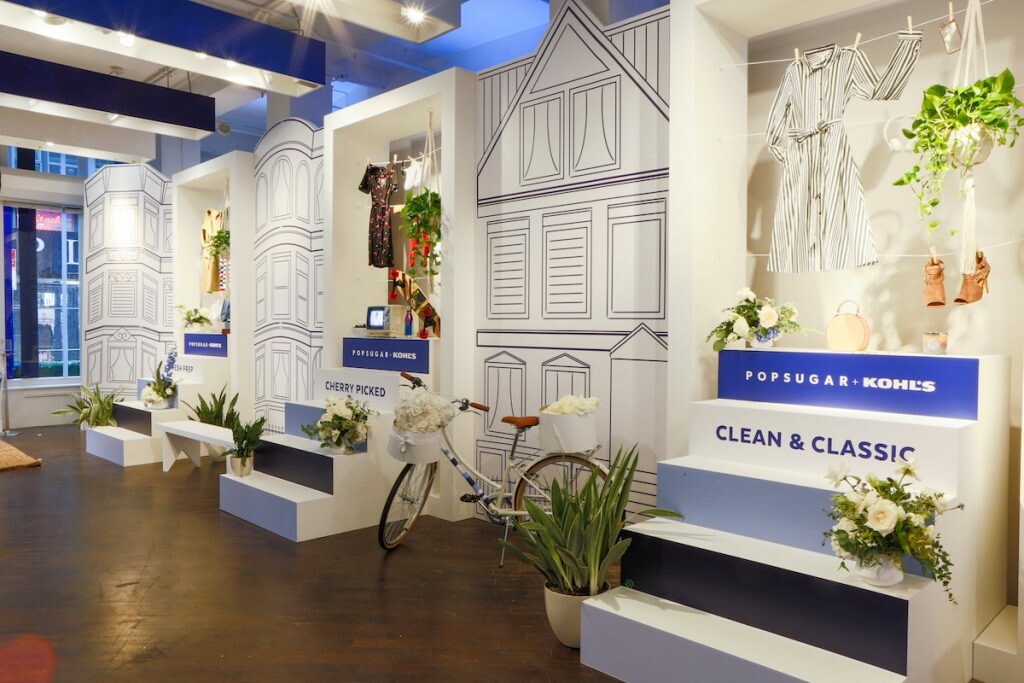
To launch the POPSUGAR at Kohl’s debut collection, the brooklyn-based agency The Gathery created an experiential pop-up store in Soho in early September. Held at this top Storefront space in Soho, the agency brought to life the Millennial-inspired collection and created a space that embodied the Everything Is Better With A Pop Of Sugar campaign with much success and buzz.
To celebrate the space and learn more about The Gathery’s approach, Storefront recently sat down with co-founder Nicky Balestrieri.
- How did this pop-up concept come about?
POPSUGAR was asking for a blue sky assignment; to celebrate the launch of this new collection. This was our first-ever joint venture in the retail space with POPSUGAR and a big brand like Kohl’s – we’ve worked with POPSUGAR on other events for 6-7 years now.
This activation specifically was about bringing the Everything Is Better With A Pop Of Sugar campaign to life, and to contextualize the reason why POPSUGAR got behind this. The idea is that POPSUGAR and Kohl’s share the value that uniqueness and individuality is what makes people special. We wanted to center this partnership around real women doing incredible things and highlight an eclectic group of women in real life.
- Talk to us a bit more about bringing this campaign to life.
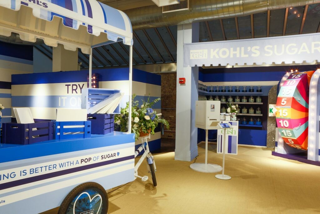
This is not a high-fashion collection for every day; the clothes are clothes you live, play and love in. With the collection’s slogan Everything Is Better With A Pop Of Sugar, what we did was imagine a street scene and then brought [the collection] to life through a flat lay photo trend. [The space] had playful storefront type things, with an interactive candy shop, Kohl’s Cash Wheel, and a section where you can put your own pop of sugar on to a gift bag.
- How did you design the interiors?
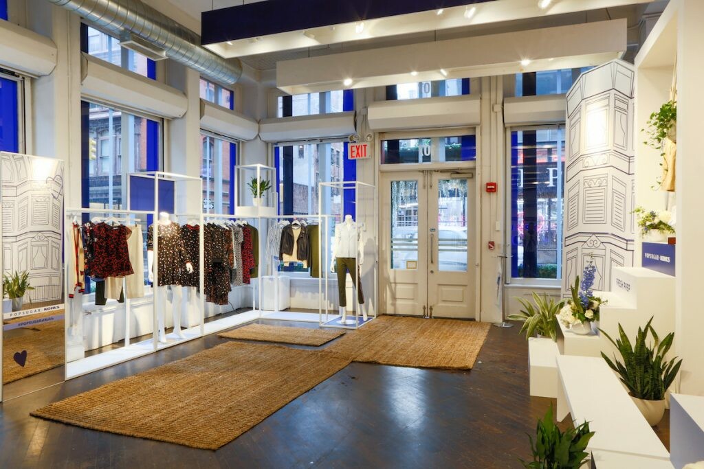
We do all of the creative services and production in-house. The aesthetic treatment was based off of the POPSUGAR stripe. The hero item throughout the collection was the POPSUGAR striped t-shirt, and things like the piping and the racks of the clothing collection were all stripes brought into the third dimension. The painting application was a big part of transforming the space.
- Why did you choose this Soho location?
The venue was chosen for its location first and foremost, it’s in a high-traffic retail area. What I liked about the space itself is that you kind of feel like you’re walking around a street corner even though you’re indoors. The L shape of the space was super helpful in creating that atmosphere too.
- What do you believe makes a great pop-up experience?
At the core of experiential is the experience itself. Smart, intelligent, interactive and photogenic design is the most important thing. For pop-up stores, the number one amplification device is the visitors themselves and you engage them through shareable design and experiences. That takes a lot of creativity.
Promotion is of course the wrapper around the core of the experience, and POPSUGAR and Kohl’s as brands, know what they’re doing in terms of that. As an agency, we get to be really hyper-creative and step out of the box; the most innovative experiences are when brands try and do more than just a store. For example, POPSUGAR could’ve just chosen to simply paint the pop-up space, but we chose to concept a whole street scene, turning it into a cultural destination.
- There was a private launch event before the store opened up to the public. Can you talk to me about how that helped to drive even more traffic and buzz?
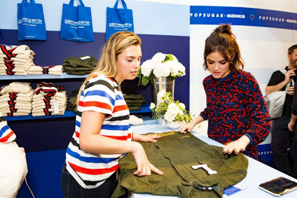
We hosted the private event on September 12th. Lisa Sugar and the marketing executives from Kohl’s introduced the collection to editors and influencers, and there was an opening cocktail hour.
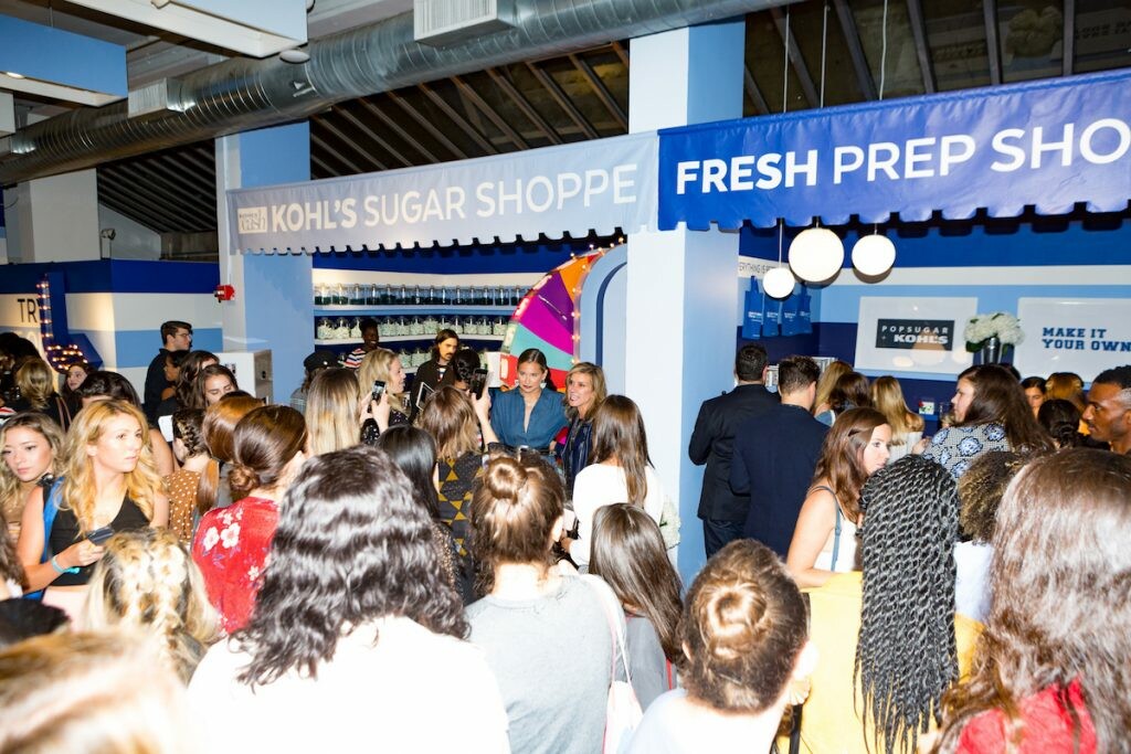
Attendees got 20% off the collection plus free shipping as an incentive. Another incentive was giving out Kohl’s Cash, the brand’s signature loyalty and rewards program (open to the public as well). We also invited celebrities like Rachel Bilson, Lucy Hale and blogger Danielle Bernstein.

