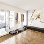
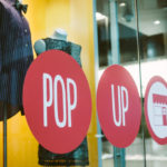
The design of a pop-up store is critical to its success. This is no surprise when you consider that much of physical retail’s value comes from the strength and power of the experience it is able to deliver.
Pop-up stores are, to some extent, concentrated microcosms of the broader physical retail spectrum. Pop-up shops, therefore, are all about the experience.
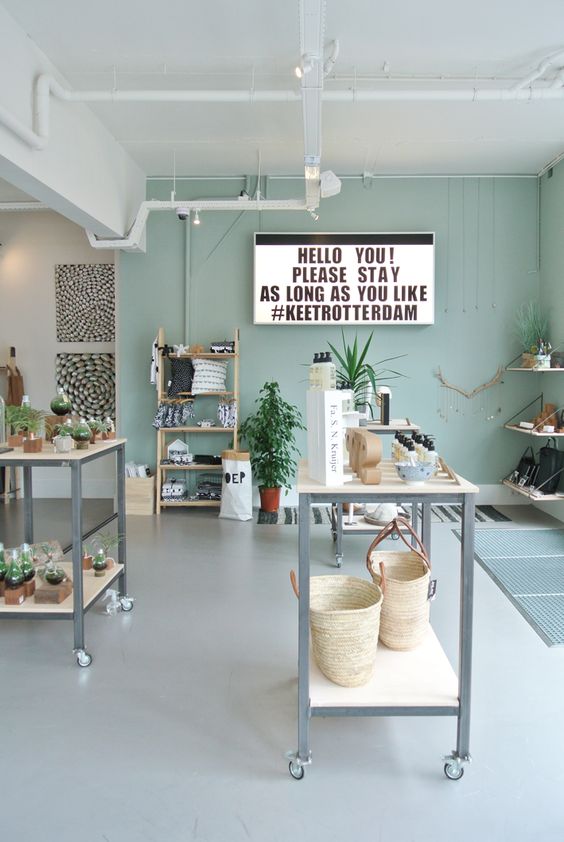
To deliver a good experience the look and feel needs to be spot on. And that doesn’t just happen. It needs to be designed to do so. But what do we mean by design? It’s not just the front of the space and window display that’s important; everything is a part of the equation. From the arrangement of merchandise, to the lighting that accentuates it, to the packaging. It’s important to not let any detail go unnoticed.
This is what design agencies call the overall design strategy. And it goes further than just design, much further. When considering how your store should look, agencies will consider your overall brand strategy including issues such as what you stand for and the core message you are trying to get across. Agencies are up to speed with the latest design trends and will truly challenge you in order to get the best results.
While for the best results we recommend hiring a design agency with experience with retail spaces (and we can introduce you to some of our wonderful partner agencies) we fully appreciate that this isn’t always in everyone’s budget.
Whether you’re looking to hire a design agency or whether you’re going to give it a go yourself, the following tips should help you out.
1. Create a Design Strategy
A design strategy is an overall understanding of what you are trying to achieve and how the design elements of the project will help you do it. This should take into account your brand and your mission but also the goals of the pop-up project. The look and feel of a pop-up should fit with who you are as a business and what you are trying to achieve. Everything from the colours you use to the way you market and promote the pop-up should come from the design and branding strategy.
The design strategy should be something you create very early on as it should impact some of the earliest decisions such as location and duration. For instance if you want an industrial design then you are going to want a location with plenty of options for industrial layouts and backgrounds. In this way you can ensure that you are building a consistent and immersive experience.
2. Guide Customers Through Your Pop Up
When choosing the perfect layout for your pop-up shop , you’ll want one that can seamlessly guide your customers throughout the entire space and retail experience. It’s a tricky balance, finding the right amount of space for customers, products on display, and room for your staff.
Though your pop-up may not be as large a space, IKEA comes out on top when it comes to well-designed store layouts. The Swedish furniture company’s stores include a clear path that directs the flow of foot traffic through experiential product displays all the way to checkout. This approach has helped IKEA predict where their customers will spend the most time (and money), which allows them to pinpoint ideal locations for high-demand products, promotional advertisements and impulse buys
3. Mind the Decompression Zone
Depending on how big your space is, the first five to 15 feet is called the “decompression zone,” where customers transition from outside to being inside your pop-up. Any products displayed in this area may be overlooked, so keep it free of merchandise or promotions you really want customers to see.
4. Go Right
Did you know that 90% of consumers immediately turn right when entering a store? That area, your power wall, should highlight premium products, promotions, new merchandise or seasonal wares. It should be eye-catching, too, as it will help pull consumers deeper into your pop-up and create a lasting impression.
“Even with high-concept statements and out-of-the-box design, it’s important that your products are at the forefront of your pop-up,” says pop-up retail design specialist and owner of Bohomodern Margarita Barry. “Let them lead the show! After all, if your goal is to introduce your products to a new audience, you want your products to tell their story on their own.”
5. Think a Step Ahead
Always think about the customer’s next move, and be strategic about where you place your most eye-catching displays. This will help control the flow of the customer’s path throughout your pop-up shop.
Create visual breaks, or speed bumps, to slow customers down and make sure they notice your merchandise instead of just browsing. Here, place impulse buys, high-demand products or promotional signage.
6. Commonly Used Retail Store Layouts
These commonly used store layouts are great considerations when you’re drawing up the floor plan for your pop-up shop:
- Herringbone: Typically used when there’s a high volume of merchandise in a small space, this layout consists of aisles alongside the left and right walls with an open space in the middle of the shop.
- Loop: Upon entering the door, this layout provides a clear path that starts on the right and loops back around to where the customer began. You can use wallspace for artsy displays, with the middle being a small version of any layout to display the rest of your merchandise.
- Free-flow: This layout is actually hardly a layout at all. It allows room for you to get creative and encourages customers to wander without guiding them down a specific path or pattern like the others. But just because this layout doesn’t have a defined pattern doesn’t mean that it’s not without any rules. It’s important to consider your customers’ preferences and behaviors when setting up the various displays and merchandise, and to keep your power wall to the right and checkout counter on the left.
“[Free-flow] encourages customers to flow freely through the store, and works best with smaller spaces,” says Barry. “Whichever layout you use, it should entice customers to move around the store to experience and potentially purchase your product(s). Typically, the easier it is to navigate the layout, the better.”
7. Integrate Technology Strategically
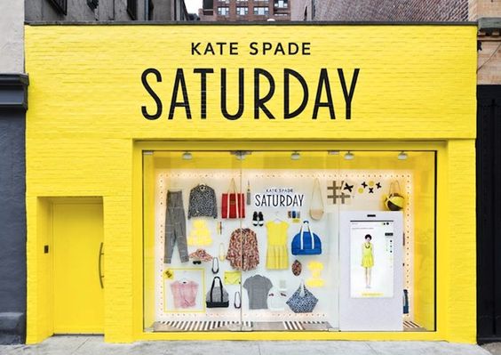
Pop-up shops provide the perfect opportunity to implement and trial new technology. From advanced touchscreen kiosks and interactive displays to simpler-to-execute tablets and in-store beacons, there are several ways to leverage technology in the design and layout of your pop-up. Many of which will only add to the shopping experience.
- Digital window displays – innovative brand messaging
- Smart kiosks – collect data and link teh physical to teh digital
- Selfie stations – make it easy for customers to engage on social media
- Smart speakers and screens – tailor the experience and message
- Virtual and augmented reality – immerse customers in the brand experience
- Beacon based marketing – tailor message and promotions depending on where they are in the store
- In store messaging – improve level of service by allowing customers to communicate with staff digitally
- AI powered recommendations – more scalable, reliable & efficient service
The above list is just a fraction of the many innovative technologies you can implement. Pop-ups stores are a perfect vehicle for trialing new techniques – just make sure they are applied strategically in line with your goals and the brand strategy.
Especially when it comes to pop-up shops, think outside the box to create an unforgettable customer experience. Forget the traditional fixtures and decor — get creative.
Pop-ups give you the chance to experiment and try new things. You have the opportunity to make a statement by doing something out of the ordinary.
When done well, unique product displays increase shareability, create positive customer experiences, and make your brand unforgettable — as long as they are synonymous with your brand.
Here are some examples of pop-ups that leveraged unique approaches to the execution of their product displays:
- COS: With the help of architecture firm Snarkitecture, the LA-based fashion label created a pop-up shop that proved less is more. Monochromatic color schemes and two half-full clothing racks resulted in a minimalistic design. The focus was on the product while simultaneously providing an unexpected experience for visitors.
- Fruit of the Loom: What do you do when you want to make your affordable product appeal to high-end customers? You create a luxury pop-up. Fruit of the Loom partnered with CP+B Boulder to open an “intentionally pretentious” boutique called Früt that highlighted their undergarments through over-the-top displays.
- Arnsdorf: If you’re on a budget, take inspiration from Australian clothing brand Arnsdorf. For their pop-up space, they created a web made from over 150 pairs of pantyhose — stretched from wall to wall and floor to ceiling — to create an abstract and eye-catching effect that paired well with their highlighted merchandise.
8. Engage the Other Senses
Your pop-up shop design doesn’t have to stop at what is eye-catching. Consider the other senses when brainstorming what all your pop-up shop’s experience will entail.
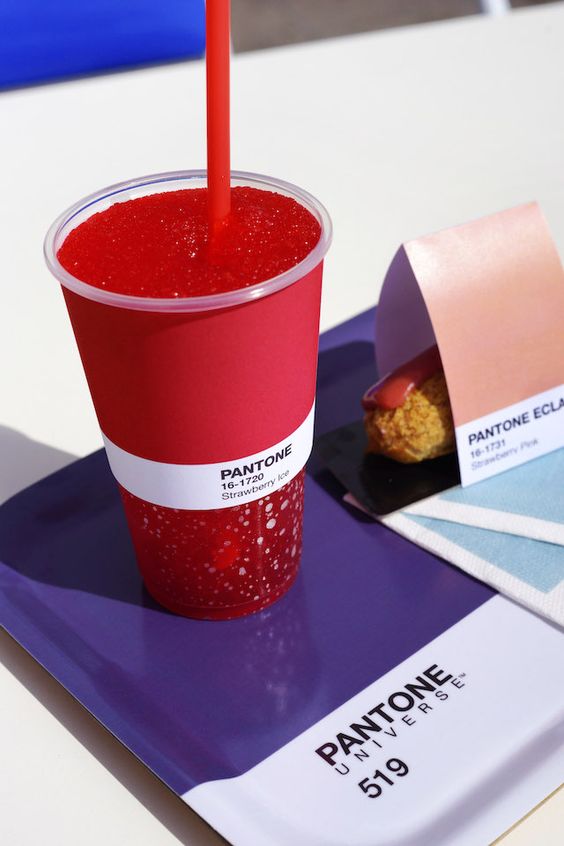
Pantone married smell and taste through their pop-up in Monaco, Pantone Cafe (See above). Inspired by the Pantone color names, they carefully curated a menu that provided tastes and smells that related back to their brand — all while venturing into a new market that offered more to their audience than what they’re known for, resulting in a truly unique brand experience.
Using smell within a retail space can increase sales, as it helps connect with consumers on an emotional level while offering a unique in-store experience — this is called scent marketing. For example, Nike saw an 80% increase in intent to purchase by adding scents in their stores. And gas stations that included coffee scents in their shopping areas saw a 300% increase in coffee purchases.
Anthropologie is another brand that uses scent to create an immersive customer experience. Aside from scented candles, sales associates are encouraged to burn incense before the store opens. The brand experience appeals to all senses in a way that makes customers feel welcomed and inspired.
When you design your pop-up shop, consider all the ways you can heighten your customers’ senses. If you sell food, make space for your customers to sample products before making a purchase. And if you’re playing music, play songs that align not only to your brand but also evoke the emotions you want your customers to feel.
9. Encourage Social Media Sharing
According to Nielsen’s Global Trust in Advertising report, three-quarters of consumers will take action after seeing a photo on Instagram, but they don’t just want to see pictures from your own social accounts. Word-of-mouth marketing is more effective — more than 90% of consumers trust recommendations from their contacts more than messages from brands. That means user-generated content from your customers can make a big difference.
“At a recent pop-up event, I encouraged customers to take photos holding up a sign [that featured our hashtag] in the space,” recalls Barry. “Once they shared publicly on social media, they were entered into a giveaway. It encouraged and incentivized people to check out the store in person.”
Make your pop-up shop social media-worthy — if a setting is aesthetically pleasing and unique, customers will be more likely to snap a photo and share. This essentially helps you create a team of influencers, so to speak, that are advocating for your brand.
Here are some quick ideas to make your pop-up shop socially shareable:
- Selfie wall: Brit + Co’s experiential #CreateGood pop-up dedicated an entire section of their space to taking selfies to share on Instagram — and people lined up to participate. Something as simple as a branded, patterned backdrop and some props can make your selfie wall hard to resist. Include a hashtag in your selfie space like Lou and Grey to keep your brand’s name a part of the social conversation.
- Fun with floors: With almost 300,000 “selfeets” on Instagram, you can make your pop-up’s flooring just as Instagram-worthy as the walls. There are tons of temporary flooring options, or you can create a beautiful pattern, use fun lights or add floor decals with enticing messages.
- Distinctive design: Turn the small details — like light fixtures and furniture — into what makes your pop-up’s experience unique and distinctive. Consider modern or antique furniture pieces and fun knobs on doors or drawers. And for lighting, take inspiration from D.C.-based sandwich shop Taylor Gourmet that used old buckets for lighting. Your unique lighting fixtures should accentuate your products and create an environment that leads to beautiful smartphone photos. First consider natural lighting, but if your space doesn’t allow for that, pass on harsh fluorescent bulbs and opt for amber-colored instead.
- How to Promote A Pop-Up Event on Social Media - July 17, 2018
- Photo Flip: 10 Unique San Francisco Pop-Up Spaces that Will Make Your Event Stand Out - July 6, 2018
- A Guide to Employee Training for Your Next Pop-Up Event - June 5, 2018

