Color is an essential part of interior design. It is known for its power to create the aesthetics or unique identity of a space, to structure its layout or even offer an element of surprise. But have you ever considered that colors also have a major influence on the emotional impact of a retail space?
Well-being and vitality, warmth and comfort, tranquility and trust, these are just some of the many feelings that colors evoke when chosen with care. Whether designing a home or retail space, the same rules apply! Here’s our guide.
1 – Attract Attention and Spark Interest
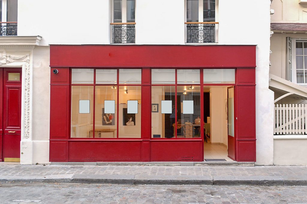
A colorful storefront helps a point of sale stand out and be seen from afar. This first point is key, because even the most interesting stores will fail to attract a single customer if no one is curious enough to enter or if people walk past without even looking inside!
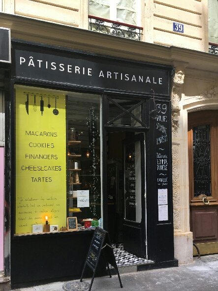
This anecdote says it all: “Emma is a gifted young baker. She planned to open a concept bakery and devoted all her time and money to finding the perfect venue in Paris. She asked me to advise her on the colors for her small cake laboratory: the space is limited and has high ceilings with large ventilation pipes running throughout. The “lab” feel of its industrial design is interesting, but it needed to be gourmet, feminine, young and trendy. But besides this, there was one major problem: on my way to our first appointment, I passed it four times – without seeing it once! In fact, the tiny storefront was completely invisible, lost between an Indian grocery and very conspicuous bargain store! But what really made it so invisible? Emma had painted it gray, a “neutral” color that tends to disappear around other colors. The solution? Repaint the storefront in neon yellow – daring but effective!”
The colors that stand out the most are first yellow and red, then turquoise. White, gray and black are all invisible, even though they represent purity, elegance or luxury.
Conclusion: if your storefront space is limited, remember to make use of bright colors or contrast in relation to your surroundings, so that it can be easily spotted!
2- Accentuate Difference, Create an Identity
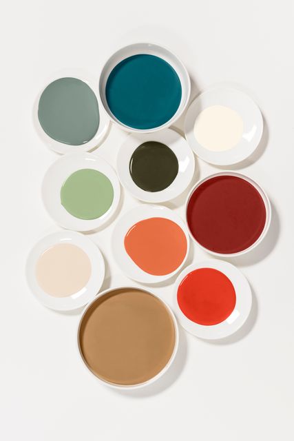
As each color carries its own message, using a variety of shades can help you personalize yours. Don’t leave it to chance: the strength of your visual identity is built upon the colors you choose. To make the best choice, therefore, consider the symbolic meanings of colors.
Be aware that some colors, such as orange or pink, promote a feeling of friendliness and even intimacy, while various blues inspire trust and a sense of security. Browns, on the other hand, evoke stability or elegance depending on the hue. This emotional universe is powerful, but also complex. To help people decipher it, I designed and published a book with Eyrolles in September 2017, called “Décobox: Couleurs & Bien-Etre” (Decobox: Colors & Well-Being).
3- Foster Well-Being, Encourage Buyers
Finally, let’s turn to the sense of well-being that colors provide. Inextricably linked to the light and volume of your space, well-being must also be reflected in the colors you choose, with an aim to enhancing the experience that you want to offer. A variety of positive effects will follow once customers enter a space and instantly feel at home: an instinctive trust kicks in, stress melts away, there is a desire to stay… and to buy!
Remember that some colors, such as yellow and turquoise, inspire a natural sense of trust. In fact, turquoise blue is THE magic color. It has a deep magnetic pull and fosters social interactions and communication. Its composition from blue and yellow tells us something about the beneficial effects it offers: on one hand it is soothing, building trust and breaking down fears, but it is also bright and sunny, awakening the senses and imparting a positive outlook.
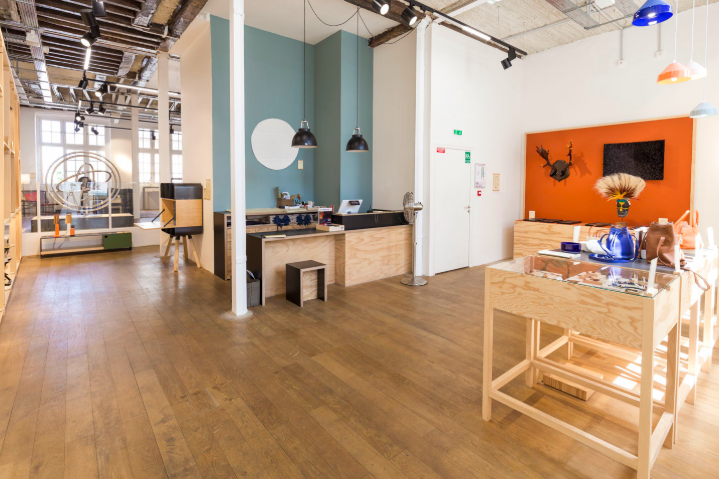
This certainly explains the success of “peacock” blue, which comes from a darker turquoise and has been widely used in recent years, most notably with the pop-up store that Les Raffineurs opened in the trendy Marais district of Paris. For façades or interiors, “peacock” or even “duck-egg” blues have the two-fold benefit of being cozy and easily matched with other colors. It is also a great base for working with intense, eye-catching colors like orange, yellow or red – all of which can be used for a truly sublime effect!
Find the perfect space for your pop-up project

