Sergio Mannino, Principal of Sergio Mannino Studio, knows a thing or two about designing the perfect pop-up store and attracting buzz. He believes that every brand needs a holistic approach in order to succeed, and his studio advises brands on things like launching a consumer brand from scratch, and building out a pop-up store or retail locations. Here are his top retail design tips to get you started.
- Experiences are the new luxury
Your website is there for convenience and your store, for experience.
Today, experiences are the new luxury because they are scarce, unique, and they can be shared and celebrated on social media. The younger generation is less interested in buying products as a status symbol; they are more interested in experiences and sharing them.
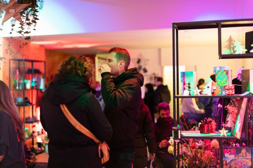
As a result of this, your retail space needs to be stimulating on all senses. It needs to be designed like a magical place where you can host music concerts, events, VIP nights, classes and so on. All these experiences should be your most powerful tool to showcase your brand values and products.
- A store is a brand activation point
Your store is no longer just a place to sell products, it is a place where your customers can meet face to face with your brand and establish a loyal relationship. You need to design your space with the primary goal to convey your brand’s values and what you stand for. You also need to train your employees to communicate these values the best they can.
Stores have been traditionally centered around the idea of selling products to clients. In the digital age, sales points are everywhere: they can be a website, an Instagram ad, a Facebook one, a store, or indeed a Pop-Up shop. Today’s stores are places for physical experience as opposed to the digital one.
Even the old model of rewarding employees based on merchandise sold is now obsolete: customers enjoy browsing, exploring, discovering; they will buy when it’s the right time with the tool that is most convenient to them, most likely online.
Beauty is the key
The truth is that beauty is a function too and we need it more than ever to make our life better. Beauty connects the living environment with our soul. You need to make sure your space is spectacularly beautiful, because this is how you touch people deeply. You need to provoke emotions, make people smile, and make them feel special the moment they walk in.
Be Unique
Your brand is special and so are you. Don’t replicate other people’s approach unless you can make it a lot better. Try to be yourself. Your space represents your brand with its own values and aesthetic. Many retailers tend to design spaces that look like their competitors’ instead of finding their own specific look.
A few years ago, the majority of my clients wanted me to incorporate a specific glass chandelier in their stores. Today they are asking me for the flower wall to take selfies. I am sure that tomorrow they will ask for something else they believe is cool and trendy. Don’t fall for this when you plan your space, you need to find elements that nobody has because your brand is special and people will remember it for that. Don’t be a follower, be a leader.
Glam Seamless: A Case Study
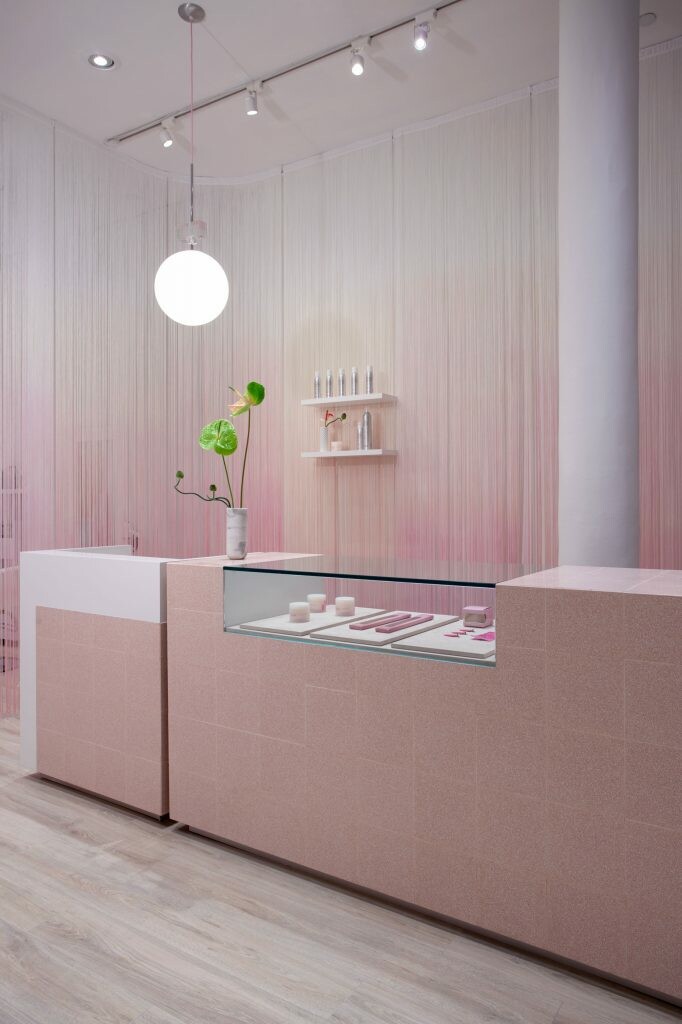
Once an entirely online venture, Glam Seamless, has been dipping into pop-up stores to give its customers a chance to purchase hair extensions, and also have them fitted. Its first one was in SoHo last year, design by our studio.
Many direct-to-consumer entrepreneurs, like Glam Seamless CEO Alexandra Cristin, are adapting to the demand for physical retail stores. Building actual storefronts – even if they are just temporary – gives customers the opportunity to physically experience products that before, they might have only seen on a store’s Instagram or website. It also means that the business is much richer in the number of ways that it can interact with its customers.
For the Glam Seamless space, we designed it without touching any of the existing elements such as partitions, lighting and electrical, or HVAC system. When you create a pop-up store you need to maximize the investment and focus on fixtures, seating, display elements etc.
Design tip: In order to connect the brand image with the space and keep certain areas less visible from the street, design a series of string curtains that divide the space, without being real partitions. In this case, we dyed them pink with an ombre effect to match the brand’s identity.
The result? The store attracted a large number of clients, including tourists, that were new to the brand. It also allowed Glam Seamless to connect with customers that knew the brand from Instagram but couldn’t see and try the product in real life.
In the digital age, a physical store is an extension of the virtual space customers see on Instagram or Facebook. The continuous live broadcasting through Instagram stories and internet videos shot in the space has turned the store into a familiar place even for customers that live far away.
Direct-to-Consumer brands are often seen as an abstract entity because customers lack the physical interaction with the people behind the company. A pop-up store allows you to bridge this gap and even profit from this retail venture.
Ready to book your own pop-up store in Brooklyn?
- Pop-Up Store Tips From A Top Brooklyn-Based Interior Design Firm - March 12, 2019

